I’d like to consider myself a child of the modern world, but … email. I’m a slave to it. I have a number of different enterprises that I run and look after, I administer 7 of my own Google Apps Domains not to mention looking after a few more for my clients (schools) who have typically many hundreds of email accounts per domain.
For a small business owner, customer communications are absolutely critical to my livelihood, and so choosing the right email client is important for me.
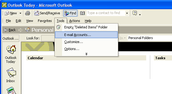
Back in the earlier days of Windows, there were really only two products for Windows users. Outlook and Outlook Express. The latter was laughable, and so I was a great lover of Outlook with its enterprise features like Public Folders, shared resources, meeting requests, etc. I loved Outlook XP when they introduced “Outlook Today” – somehow this was the pinnacle of technological progress being able to see my calendar and my emails and my task list all in a friendly view.
Then came Gmail and I never looked back. In comparison, Outlook felt bloated and slow – probably because email demands have increased over the years and we expect to keep mailboxes of 15GB and more, with everything instantly accessible.
But webmail was lacking in some ways. Firstly the hassle of multiple sign-ins, and the fact that I couldn’t keep multiple calendars from different accounts (yes I know this is a bizarre thing to need…)
 For years now I’ve been using the Windows 8.1 and Windows 10 Mail client and in the most part I’ve found it excellent. But… lacking.
There’s no native access to Gmail contacts or Calendar (although it is possible to view your Gmail calendar now). It’s a very well designed interface, but it lacks configurability, such as using different views, specifying exactly how much of the last 15 years of email I’d like to download, advanced email signatures, and I always need to revert back to Gmail web interface to search my email archive. For years I’ve kept my eyes out for a new mail client.
Enter… Mailbird 2.0. The feature set was attractive:

- A “coming of age” email client
- All the obvious things like multiple account support
- A really nice integration with Google Calendar and contacts
- Unified email inbox (this has become important to me)
- Quick, batch archiving of emails in multiple accounts (Outlook 2016 is missing this!)
- Touchscreen support
- Some other great integrations: a Whatsapp sidebar, Moo.do, and loads of other apps
- Identity support, i.e. advanced multiple email signatures
As soon as I downloaded it, I loved it so I purchased it within a few hours and I’ve been running it for a couple of weeks now.
Here’s my review.
Speed
First things first. It’s fast. Searching is fast, the UI doesn’t hang randomly as I’ve come to expect from Outlook, and I love the keyboard shortcut support. I really like multiple selecting emails in the unified view and hitting E to archive them into their respective archive folders. Getting to “inbox zero” is a big thing for me, as I feel like I am sinking under email sometimes, so this is good.
Reliability
An email client must not crash. Ever. Having put Mailbird 2.0 through its paces with my 10 email accounts ranging from Gmail to Office 365, each with gigabytes of mail, attachments, folders, tags, etc., I’m pretty happy on the reliability aspect.
Configurability
The application supports two view styles: the traditional Outlook style reading pane at the bottom right with email list above it, and the newer style email list on the left:
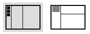
I’m a configurability nerd, and I like a little more control. Whilst I can drag panes to make them bigger and smaller, it’s not amazing in this respect. But – life is too short, and it does what I need so I’m happy here.
Email signatures
Excellent support for advanced signatures. With one exception, which you may consider minor but to some it’s very important. It doesn’t allow attaching images to the signature. You can link to images online, but not attach.
Some email purists might consider this a good thing: attaching a file to every email you send makes email bigger, and takes up more storage space, increases bandwidth use, etc. For me it’s a small price to pay to ensure the signature appears correctly on the screen, as most clients block linked images by default.
I raised this with Mailbird support, their first response was that attaching images to a signature could create a security flaw as a trojan might inject a virus into the signature. I responded by saying that they should probably consider disallowing email attachments altogether in that case, not just to signatures. They responded well and said they would consider this for future developments.
Core reading and writing functionality
The main look and feel of the interface is similar to Outlook in that you can double-click on an email in the inbox list and a new window will open.
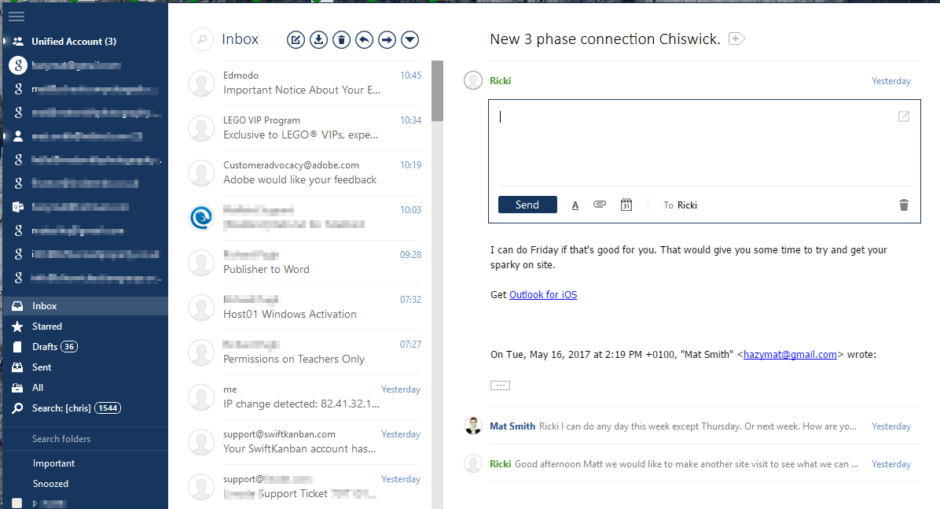
However Mailbird has this quick “in-line” email compose view:
This is the default way of responding to an email, if you hit R for reply or use the button over the email in the preview pane: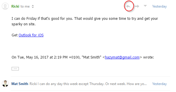
This inline view is the biggest problem with Mailbird.
To date I’ve lost a few emails, and been confounded by what to press and where, when you need to change the recipients, subject, or anything else.
Here are the problems:
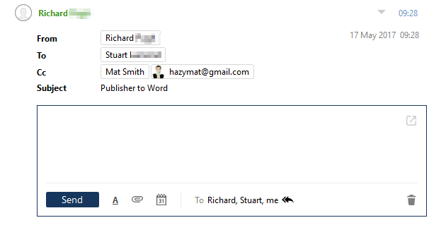
- If you “reply to all”, it only shows the primary recipient at the top, i.e. the person who sent the email. That’s fine, because at the bottom it lists all recipients
- Now what if I want to change the recipients? You would click on the little double arrow at the bottom, wouldn’t you? No. That switches between “reply” and “reply to all”
- So you’d click on the names at the bottom, right? No. That does nothing.
- So you’d click on the same line as the green name at the top, right? No. That collapses the inline view and the whole email and you have to start again.
- So you’d click on the little arrow on the right at the top? No, that brings up a context menu for the original email, which is completely useless when you want to do something with the email you are writing.
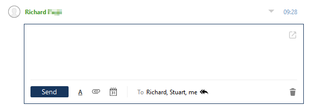
- Ok so you click on the green name at the top. That shows what I need:
- Let’s say you’ve gone ahead and spent 30 minutes writing a response to your email. Can you see where I’m going with this…
- You click on a name at the top to remove it (you don’t need to CC yourself in do you?)
- Right-click – no option to remove recipient
- Click and press delete – woah. You just lost the email you wrote. There’s an option to “UNDO” that pops up at the bottom, but when you press it, it just un-deletes the original email, it doesn’t restore your draft!
Conclusion
There are a few other things that bug me about the inline view, which make it very difficult to use in my opinion. This aspect lacks polish.
Most importantly, I should never lose a draft. Ever. This is a big problem for me.
Searching is fast but I can’t do powerful searches (date ranges, field searches).
The client uses screen space very efficiently.
I’m unable to specify views. For example I can’t show unread emails. If you need to get to Inbox Zero, this makes it hard work as you’d have to search through hundreds of emails to find that one unread email to mark it as read!
I can click quickly between huge mailboxes without any lag. This is excellent.
Leave a Reply